Create a nCoV Coverage Map of China
- 2020-02-01
- Ginkgoch
The beginning of 2020 is full of unfortunate news. The spread of new pneumonia - nCoV, Kobe’s gone … It hurts me all the time. In order not to disturb the country, I stayed at home for a few days in the new year. From time to time, pick up your phone and observe the spread of the disease. The following map is a typical mapping software that helps me to know the situation.
- Preface
- Let’s start with the environment
- Create project, add references
- GIS Data
- The rest becomes simple
- Summary
Preface
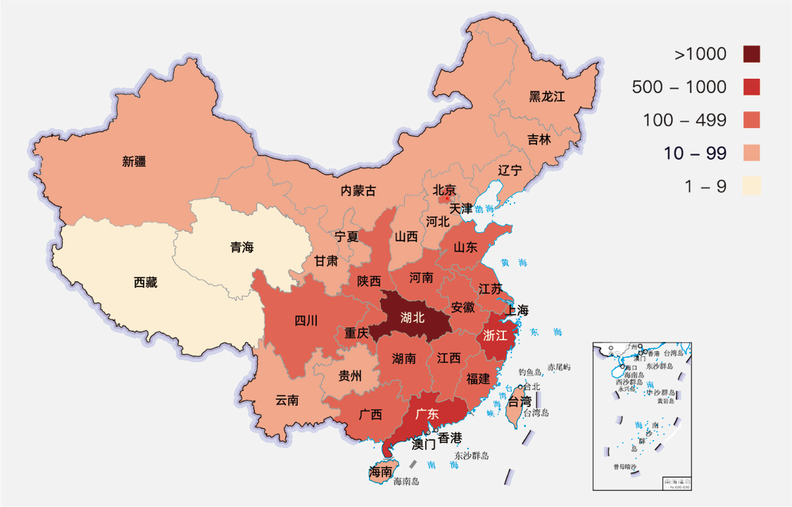
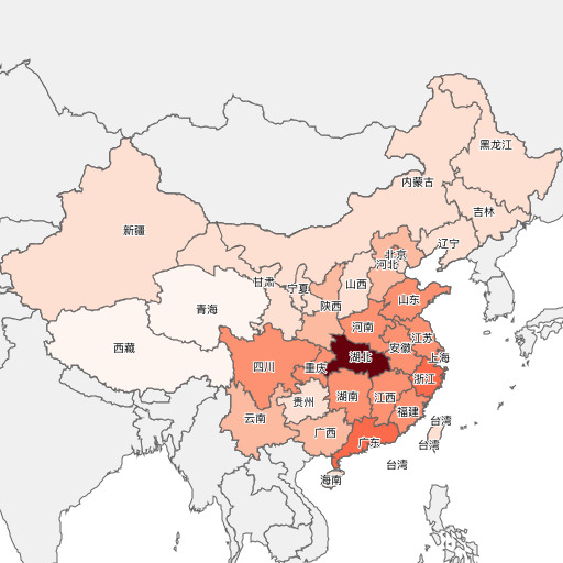
Whenever I see this static picture, I want to know a few more information that is not represented here.
- We can compare the range of confirmed patients in a province by color and legend. But we cannot recognize the specific number of patients in a province on this picture.
- Due to a static map, we cannot get city-level information. If the map can be dragged, zooming in and out, it will be much convenient.
- Every time I see red, I feel anxious. Can it be changed to other colors, I am more acceptable.
Based on these two small functions, I am going to introduce how to make a map software from 0 to 1, step by step. I am planning to do it in two phases.
- Generate a static picture with the most concise code first. Through this phase, let’s get to know the API of
Ginkgochmap development. - After we learned the
APIforGinkgoch Map Library, we will transform this program into a map service, and let it work with a well-known map UI libraryLeafletto build an interactive mapping software for web.
In this article, I will kick-off by building a cross platform command line tool to generate a static map image like I pasted above.
Ginkgoch map library is a GIS full stack development kit. You can develop map-related command line programs, map desktop programs, and map services with only one programming language - JavaScript.
Let’s start with the environment
In the old time, building a mapping software requires to master several programming language to be competent for a complete project. For example, a typical GIS B/S application is formed by a mapping service which uses Java, C# or other back-end programming languages, and JavaScript + HTML for developing front-end presentation.
Today we gonna use Ginkgoch Map Library to develop, we no longer need to know other programming languages; instead, JavaScript is the only required skill; even frontend developers can develop cross platform mapping software. For a minimalist development environment, we only need 2 tools: Node.js (version 8 or above) and vscode.
This article takes care of novices and includes a lot basic technical content. Please ignore the content that you already familiar with.
Create project, add references
Next, we create a project directory. Just use the following command. (I personally prefer to use the command line, because I usually use macOS for daily use of machines. So the following command lines are performed by macOS for verification).
1 | # create work folder |
The
canvaslibrary is referenced here because Node.js does not provide a drawing API, we can only reference a third-partyNode.jslibrary instead.
Till now, our project has been established.
GIS Data
The data in GIS applications is very important. I divided it into static and dynamic data. Static data is our geometry and their specific feature data. Such as the name of the area. Dynamic data is the epidemic situation that we are following in real time.
Generally static data is easier to find. Searching in google with China map data csv, json, shapefile will list you lots of result. In this project, I am going to use shapefile as my static data. [Here] (https://github.com/ginkgoch/nCoV-map/tree/develop/data) You can find the following data, which we will use later. After downloading, put them under the data directory of the project.
- chn/
- gadm36_CHN_1_3857.shp - province level data
- gadm36_CHN_2_3857.shp - city level data
- cntry02.shp - world level data
Dynamic data will be a bit more difficult to get. I wrote a crawler to crawled regularly. If you are interesting in it, we can chat privately. But as an example, I put a few copies of the outbreak data in the data/infected directory for example.
The rest becomes simple
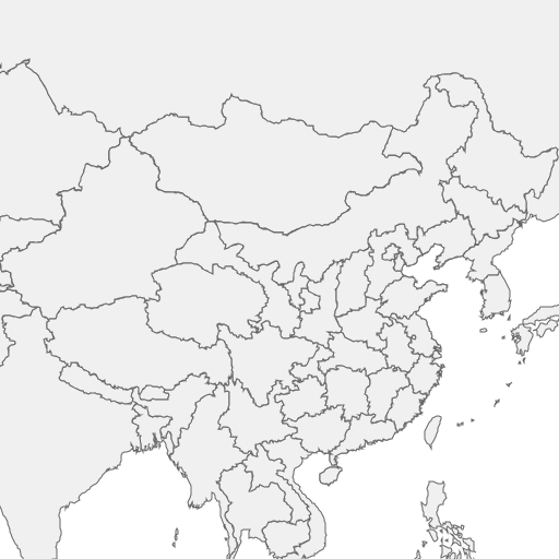
Overlays world data
First, we define a function to create a map layer, a shapefile is a data layer, and multiple data layers are superimposed to form our desired map. With ginkgoch-map, we define a layer like this.
1 | function createLayerWithDefaultStyle(filePath) { |
After we got layer, we can peek how the layer forms and we can take a thumbnail of cntry02.shp with following code:
1 | let worldLayer = createLayerWithDefaultStyle('../data/cntry02.shp'); |
Then we execute the command below, it will output an image of the layer.
1 | node tutorial-01.js |
Overlays China Data
Definitely, this is not final result, we need to superimpose the province data for more detail. Let’s move on.
1 | const [imageWidth, imageHeight] = [512, 512]; |
Let’s open picture tutorial-01-default.png, check that the province of China are overlaps on the world map.
Adjust the Viewport
Oh? Too small ~ OK, let’s adjust the viewport of the map.
1 | await provinceLayer.open(); |
Connect Dynamic Data
We rendered the static data, while drawing borders for provinces of China. Next, we will connect dynamic infection data to map. How do we do it?
First, let’s look at the attributed data of static data. Shapefile feature data is stored in * .dbf files. You can choose to open the dbf file with your favorite tools. I personally use the shapefile viewer to check it out. Refer to this project for the tool.
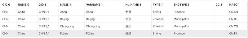
NL_NAME_1 is the name of the province we need, and then we take a look at a snippet of dynamic data.
1 | [ |
Interestingly, the dynamic data also includes the province name provinceShortName; and the number of infections, suspects, cures, and deaths. Now, all we have to do is associate the static data with NL_NAME_1 and dynamic data withprovinceShortName. This is built-in function in ginkgoch-map.
First, we define a function to help us define a relationship.
1 | /** |
Then build a mapping function for the 4 columns.
1 | function connectDynamicData(layer) { |
Finally, we call this function for mapping.
1 | //...omit the surrounded code |
At this point, we can assume that provinceLayer already contains dynamic data. It will dynamically load the mapping relationship to find the required data when necessary.
Styling the Map
We are moving into the last step: Styling the map. We break down the number of infected people into several levels, and render different colors according to the levels to indicate the severity. Better yet, ginkgoch-map provides a corresponding API for rendering.
We first define a function to create a styled object Style.
1 | function _getClassBreakStyle(field) { |
Then apply it to the layer, and it works.
1 | let confirmedCountStyle = _getClassBreakStyle('confirmedCount'); |
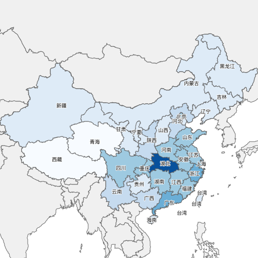
Isn’t it interesting? We are now free to replace the color palette and make it blue. Just replace this code.
1 | // let activePallette = ['#fff5f0', '#fee0d2', '#fcbba1', '#fc9272', '#fb6a4a', '#ef3b2c', '#cb181d', '#67000d']; |
Summary
You could find all the code implementation at: https://github.com/ginkgoch/nCoV-map/tree/develop/tutorials
Looks like a lot work to do, most of the code is business code, and style settings. It’s quite simple to understand. That’s it for today. When I have time later, I will write another article to migrate this code to a map service as well as an interactive map software for browser. Feel free to contact me by [email protected] or leave me message in my website ginkgoch.com.
Happy Mapping!